CRM = Cleverly Rapid & Magnetic
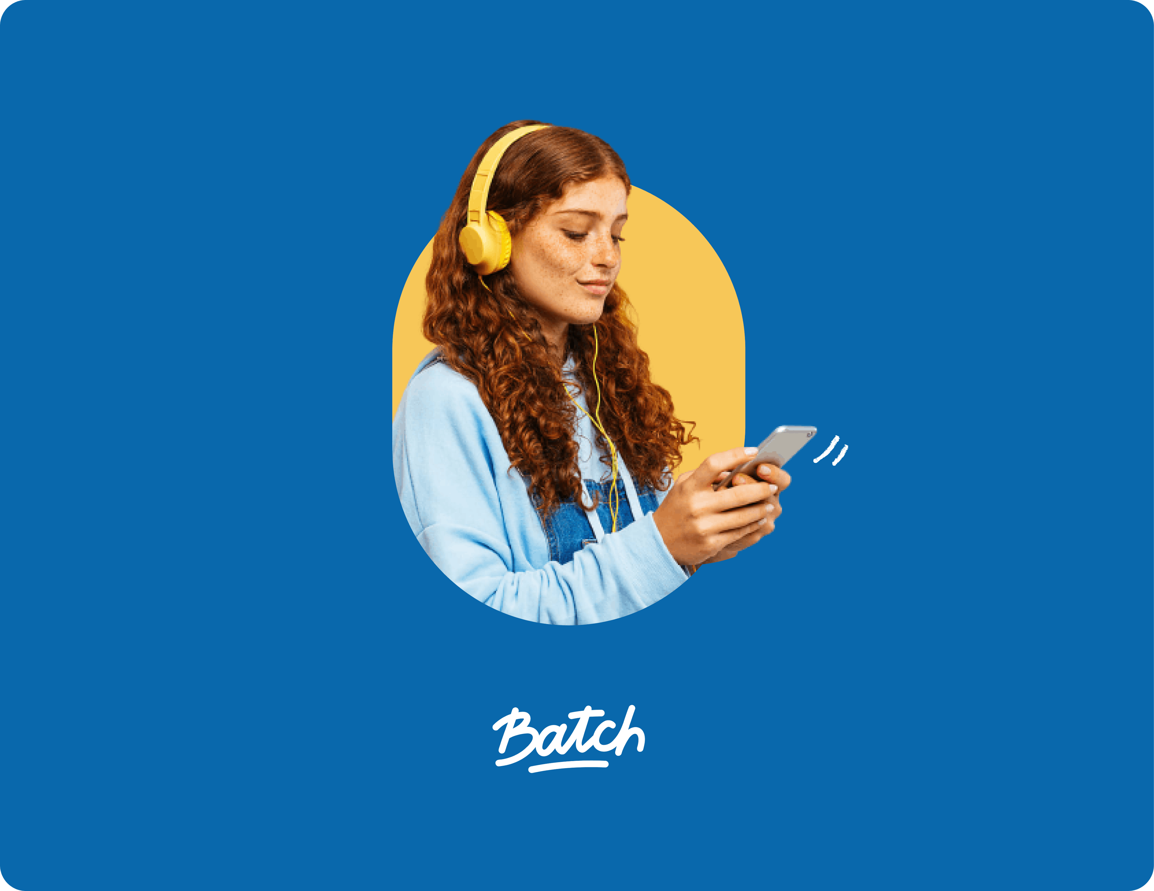
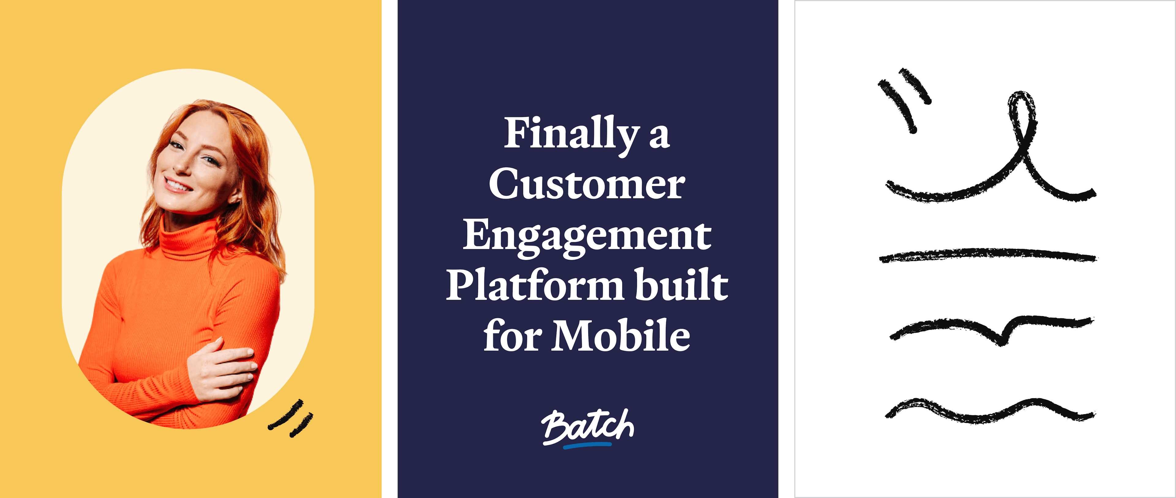
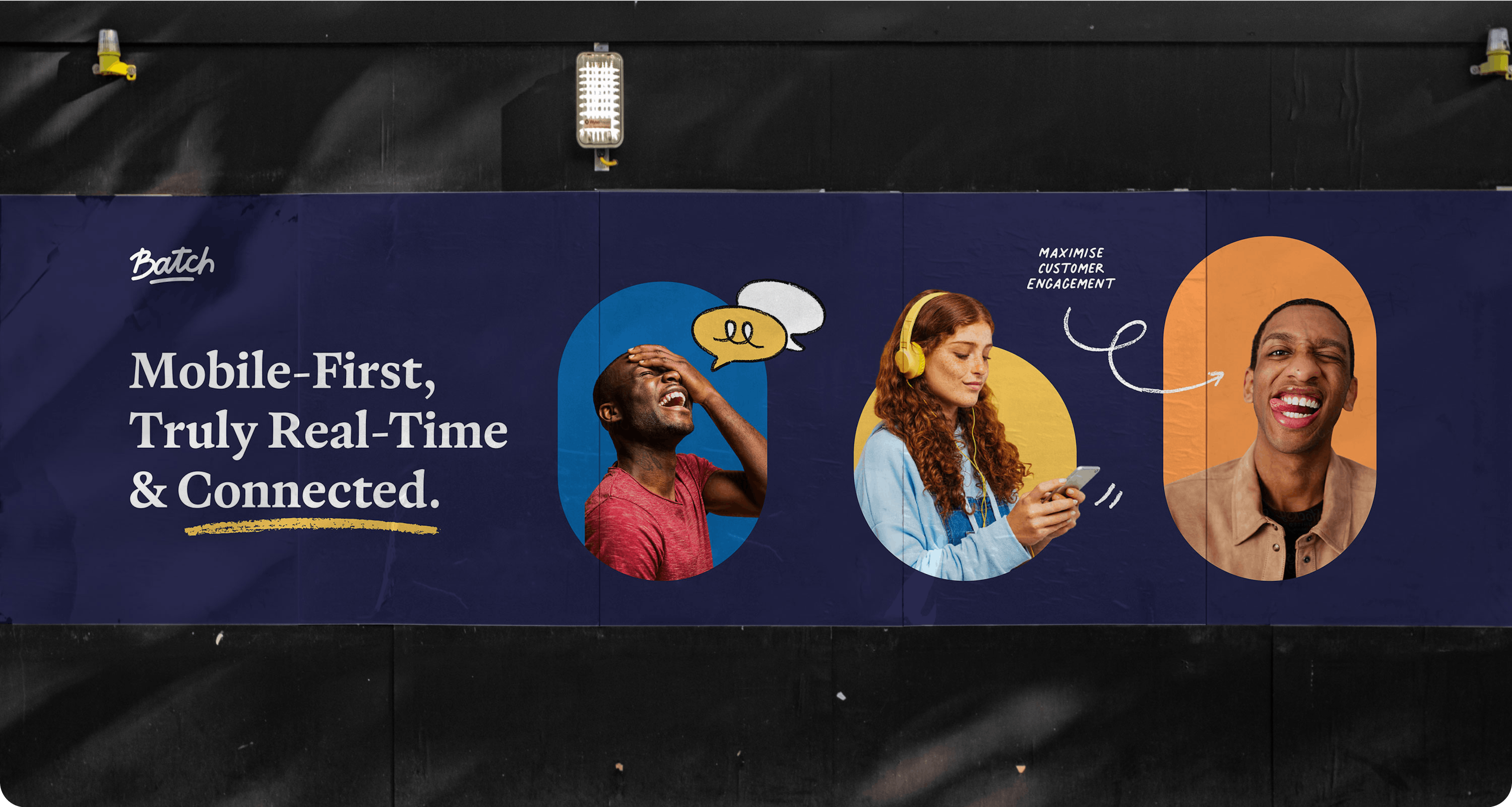
Batch, a platform that makes CRM strategies fast and automated, consulted us for a total redesign of their website and branding. We designed an energetic identity, using a palette of vibrant complementary hues for maximum contrast. The branding emphasizes the human touch through carefully selected photos and freehand illustrations enriching the graphic identity.
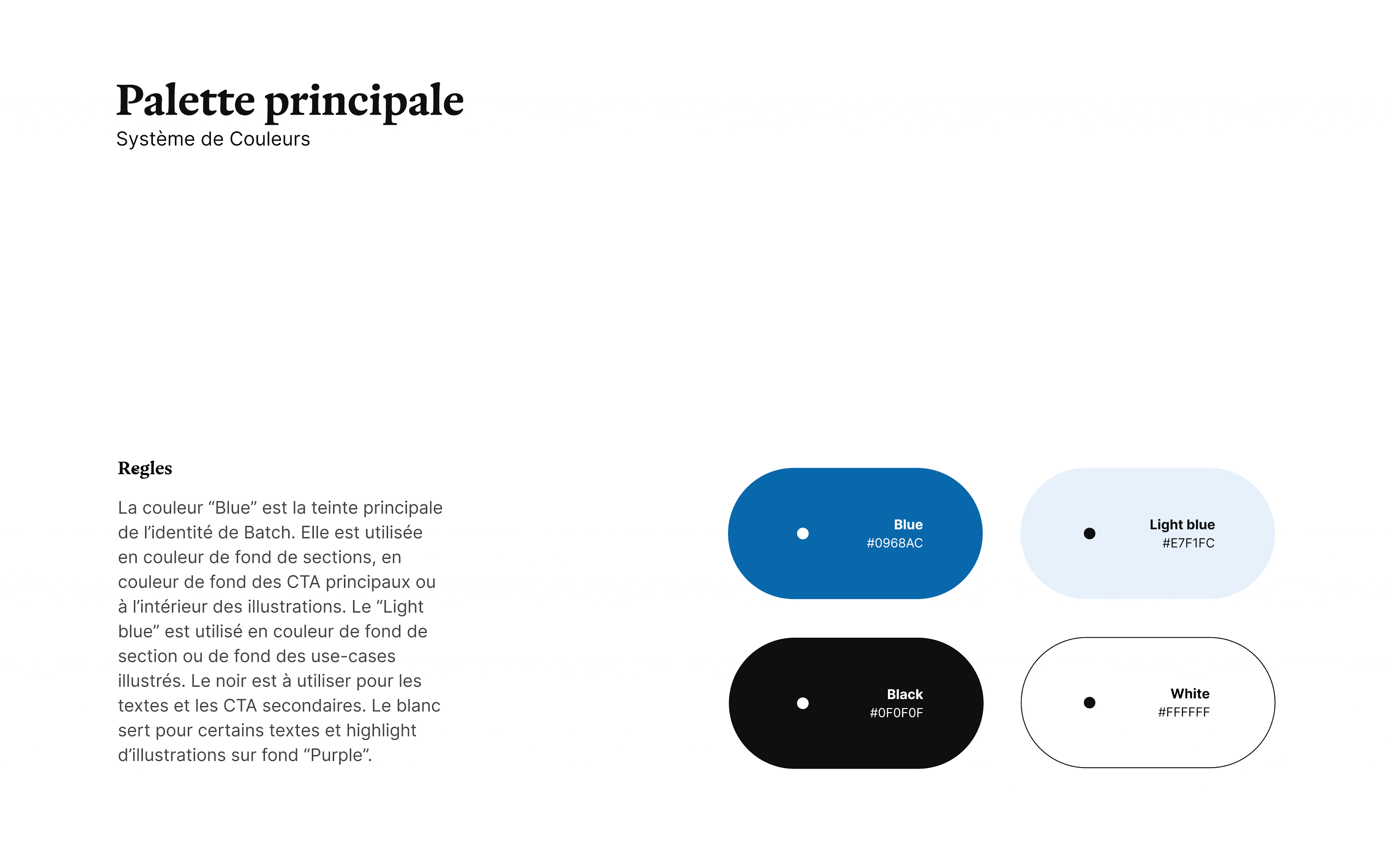
The color palette was designed in two stages: bold, vivid hues for marketing elements, and softer variations for section backgrounds or illustrations. The typography, round with a slight serif, adds softness and sophistication. Clipped photos on colored backgrounds show smiling people, accentuating the brand's human and approachable aspect.
We also reworked the logo, adjusting the thickness of the line under the name and the proportions of the letters for visual harmony. All these elements were integrated into the website, the online ambassador for this warm, accessible new identity.
“Batch you didn't see that coming!” a customer with an approximate sense of humor might have said.


More projects
The Family Doctor Reinvented
Primary designs innovative, patient-centered medical offices. We crafted a brand for them that is as warm as it is modern, seamlessly bridging the gap between in-person and digital experiences.
A matter of goals
Sendinblue, with 7 years of experience, expands its range of marketing tools. The rebranding introduced a new identity, a revamped style guide, and an innovative website, meeting the growing needs of businesses to achieve their goals effectively.
The neobank for freelancers
Qonto approached us to establish the foundations of its brand universe. From digital design to web development, including the design of the blue card: we infused energy into this emerging brand.