You are the user, not the product.
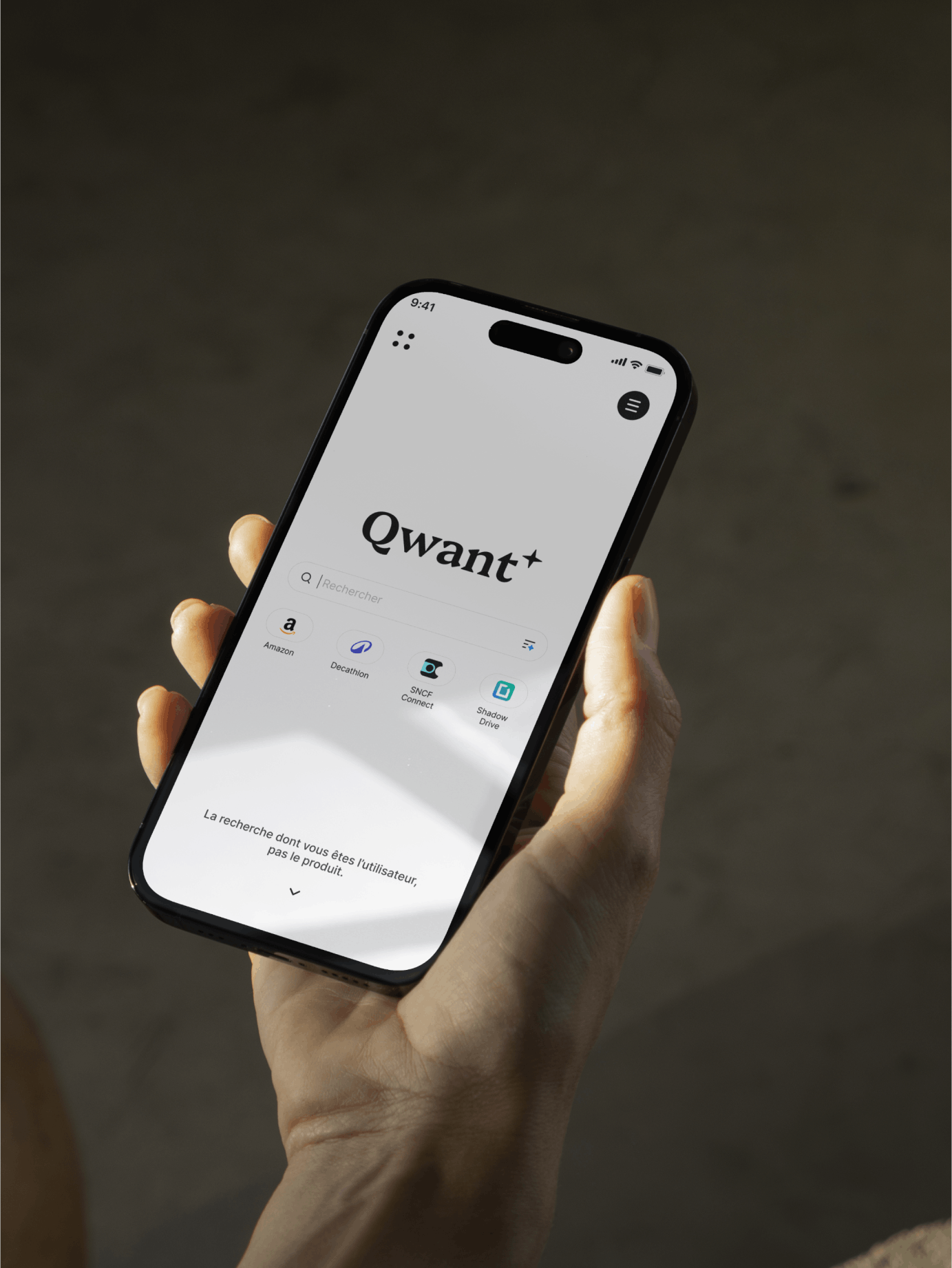
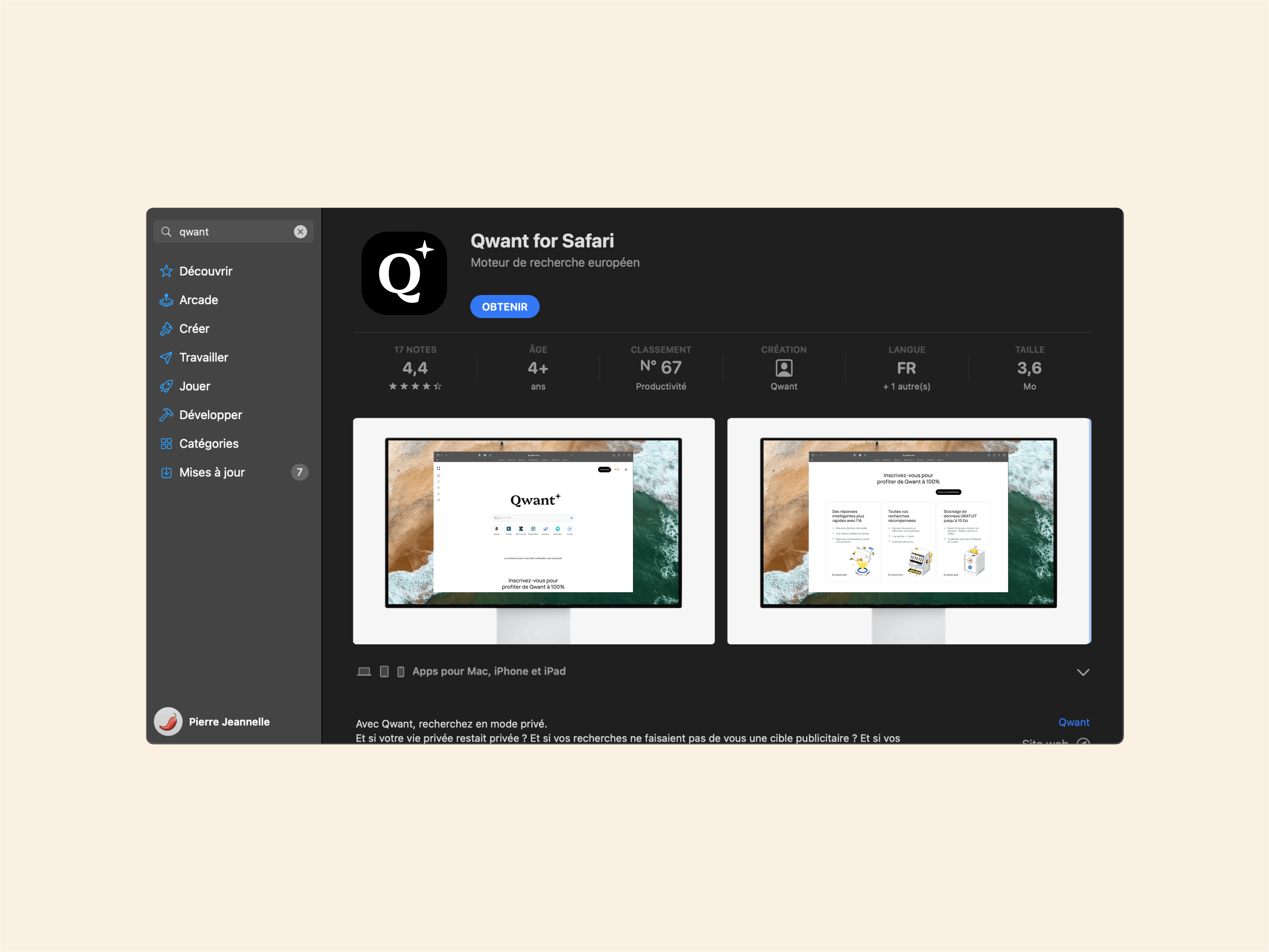
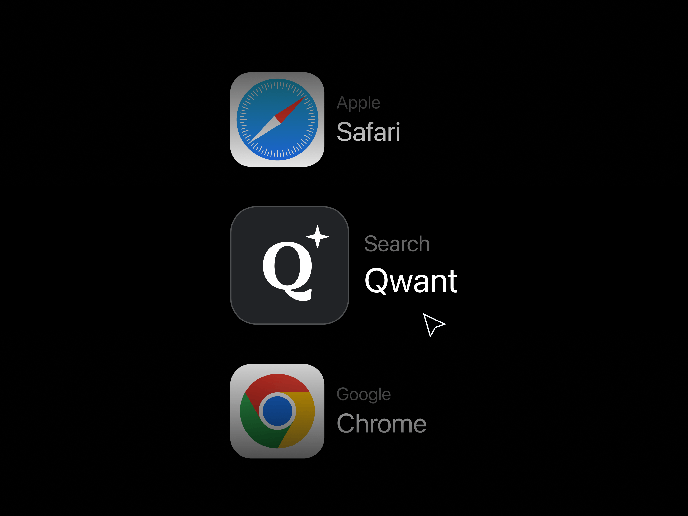
Until now, Qwant was the search engine that knew nothing about you. That's still the case, but there are a few new features. Qwant is positioning itself as a pioneer by integrating AI into its product and is moving, slowly but surely, towards indexing independence. Faced with these significant advancesp, their teams approached our agency to rethink their overall brand identity. For them, we created a branding that reflects progress at its most beneficial: sound, secure technology at the service of people.
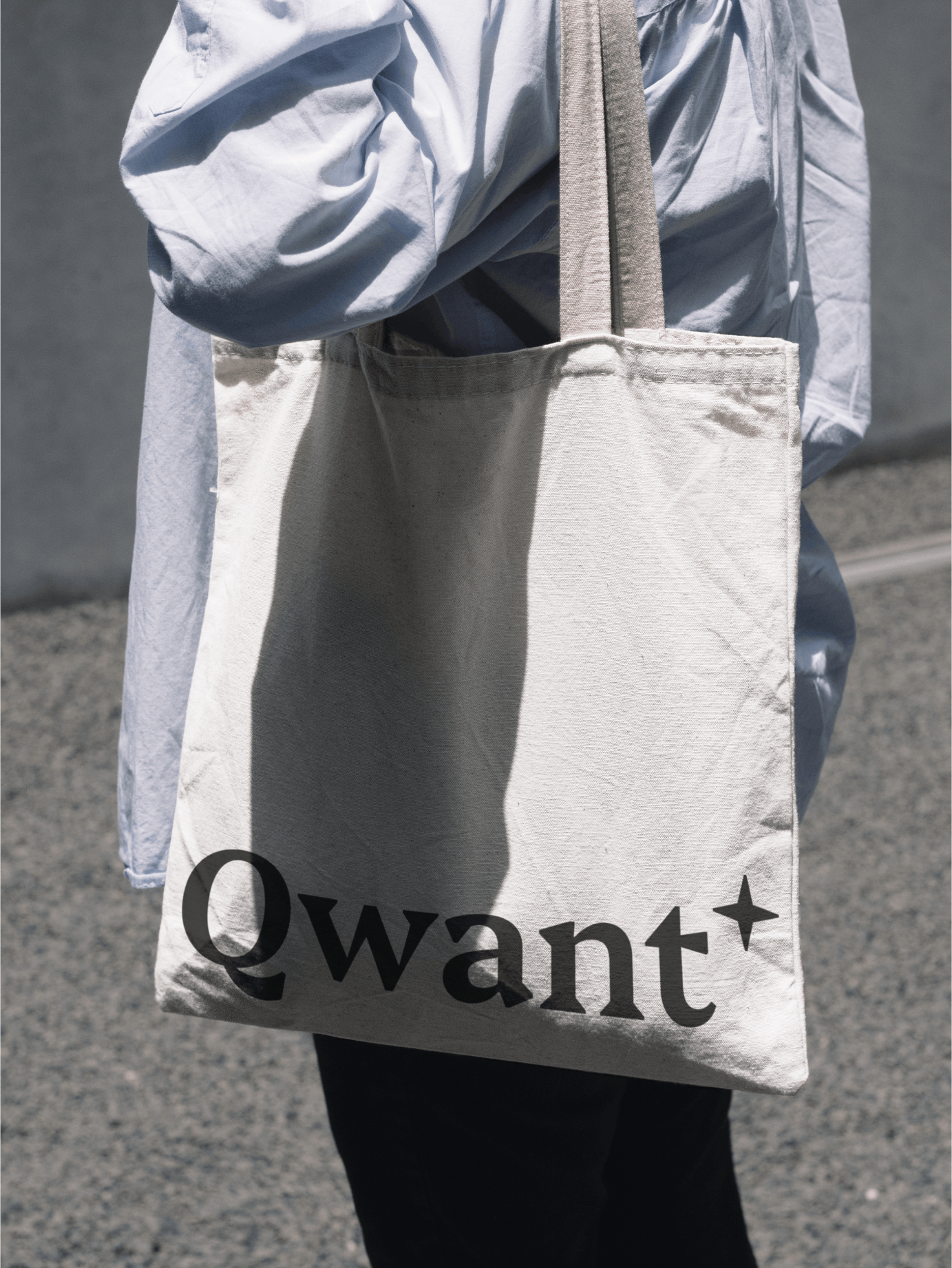
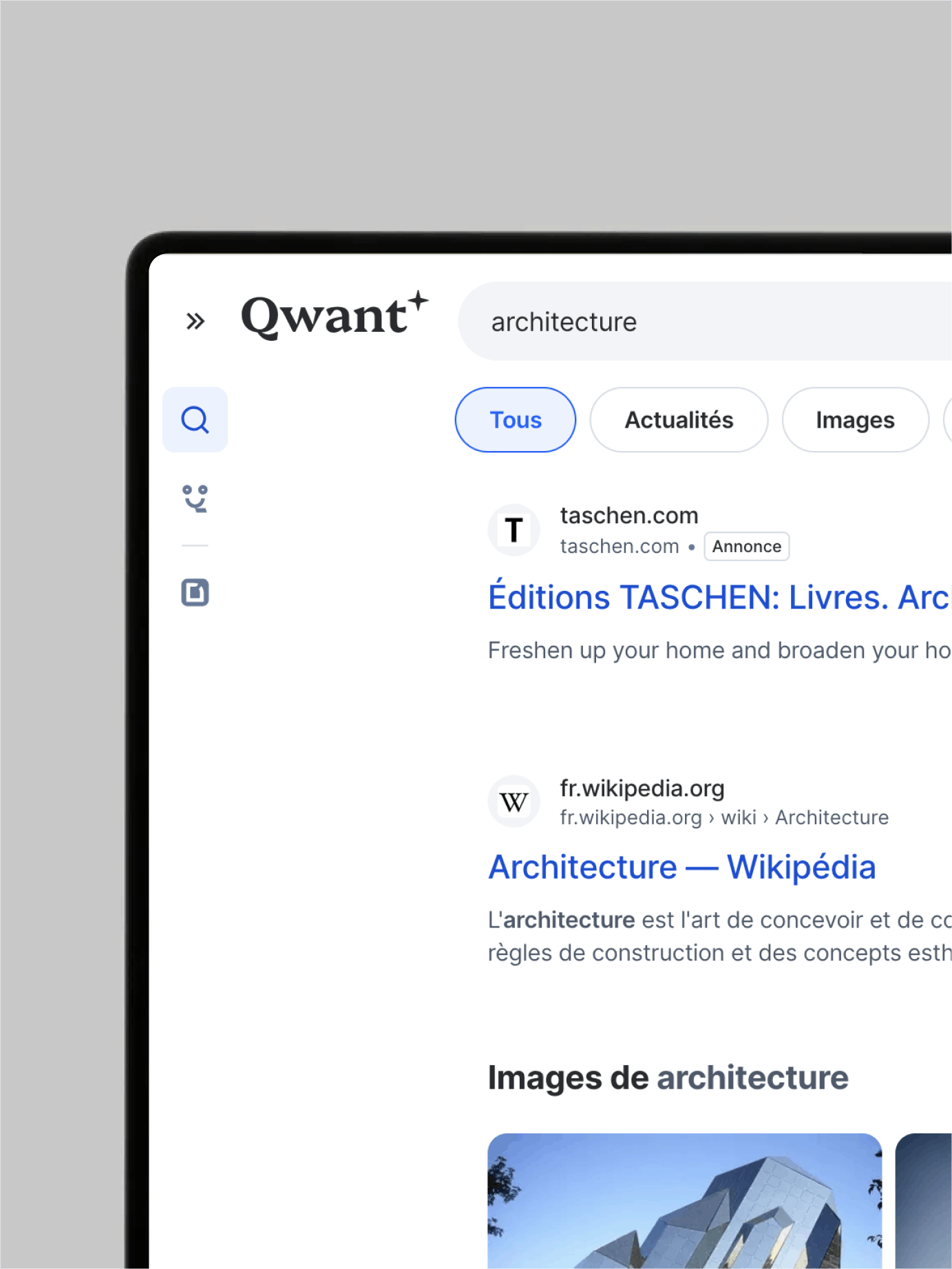
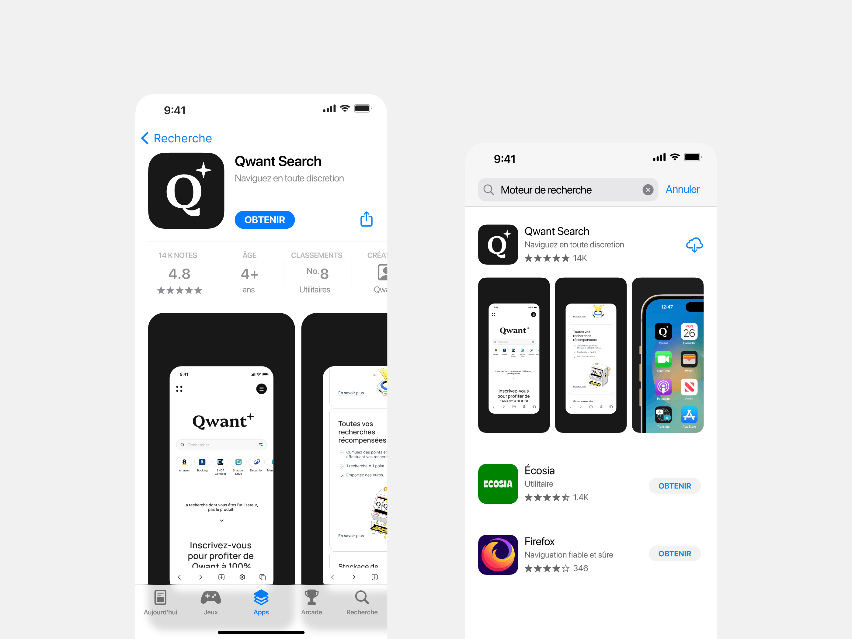
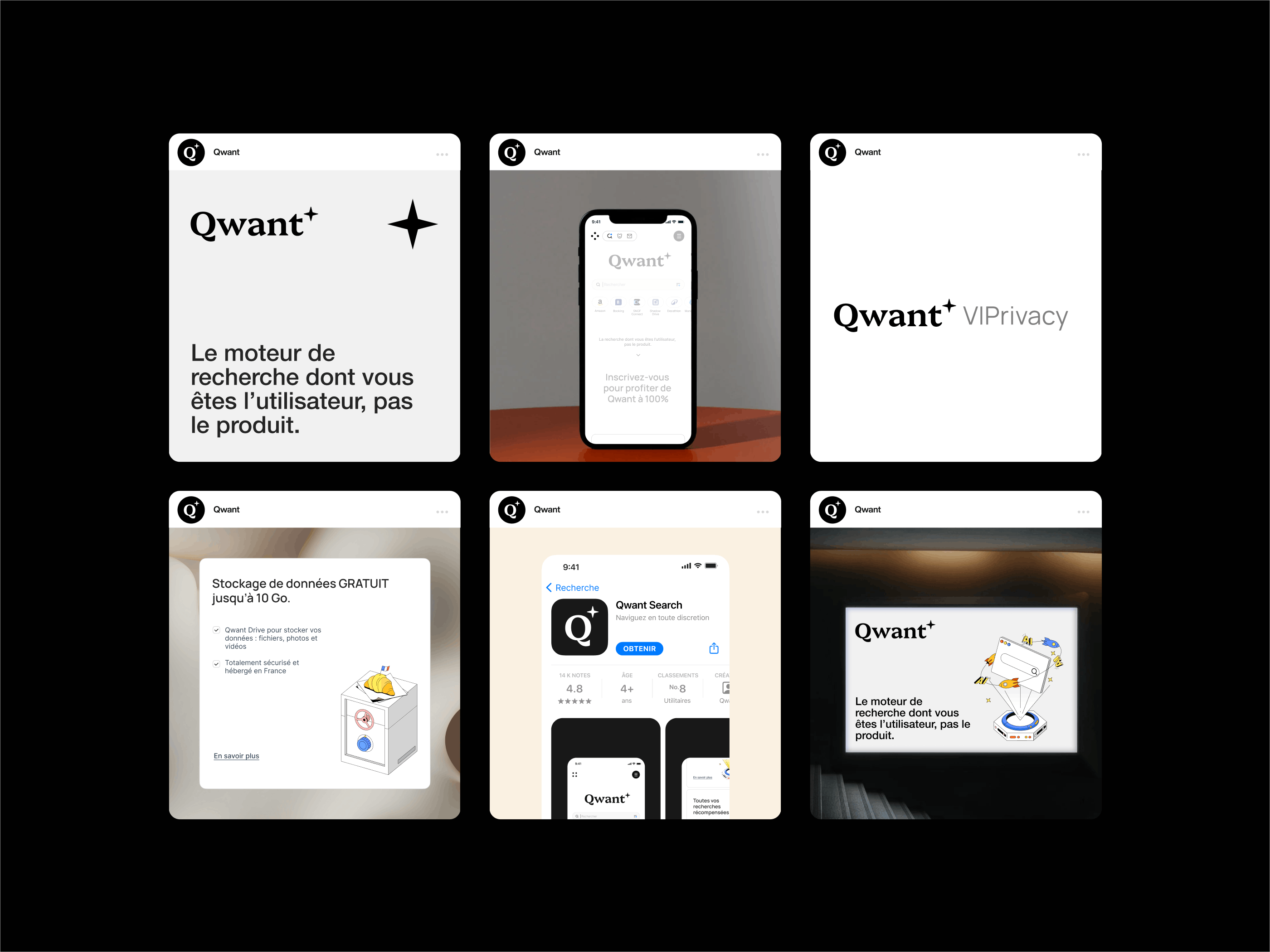
To stay true to Qwant's positioning, we designed a logo with a unique typography, reassuring yet very modern. A subtle star accompanies the name, symbolizing support for AI and the brand's ethical direction. Inspired by institutional references such as the traditional press, the art direction combines sobriety and modernity, and the minimalist interface, with its white and black mode options, reflects an intuitive, tailor-made technology, true to Qwant's values.
Joanna Lawniczak's illustrations bring a freshness to the design; we worked with her to develop a proprietary visual style suited to Qwant's era and environment. Like the search engine's artificial intelligence, the brand's experience, interface and identity are now at the service of its users.
More Projects
The art of consistency, from pixel to product.
Since 2012, we've been working with Xola - an online booking platform dedicated to the tourism and leisure industries - to shape a unified experience, from branding to UX, designed from the outset for all media: mobiles, tablets, desktops and booths.
Your storage solution
You know that moment when you're moving, packing your belongings, and it feels like your life fits into a box? Homebox is here to safeguard your things and support you through life’s transitions with simple, secure storage for what matters most.
The neobank for freelancers
Qonto approached us to establish the foundations of its brand universe. From digital design to web development, including the design of the blue card: we infused energy into this emerging brand.
