
Everyday lightness.
Kara.ai is a serious but colorful management application for overloaded schedules (warning: this service is only intended for sales people in a hurry). The aim is to pool all actions to be carried out on the same platform in the form of a checklist.
An explosive brand.
When we let our original and singular side do the talking, we get a service with an identity as explosive as confetti crackers, as colorful as a paint palette, as dynamic as dynamite! Kara.ai entrusted us with the creation of its identity and product, with fun and creativity as its watchwords. The team took up the challenge with gusto, designing their logo, choosing colors, creating emojis and many other surprises.


Hot ahead!
A good day starts with a cup of coffee, and obviously things work the same way when it comes to creating a logo. The Kara team wanted its identity to be based on this essential moment for many of us. That moment when we all take the time to charge our batteries so that we can fully face the challenges of everyday life. So we came up with a logo that blends roundness and colour, designed using the "golden circle" construction technique to ensure the harmonious proportions of the final visual.


Multiply the possibilities.
Creating a logo is a major challenge. As the symbol of a brand, it allows it to reveal its identity and personality. For Kara, it was simple: we needed colour, originality and explosiveness. As the theme was coffee, we came up with a number of variations on the concept. A logo to see on the spot or to take away!


Confetti.
How do you find a simple and original way to entertain and motivate users? To answer this question, we based ourselves on the principles of gamification to reward users for each series of tasks they complete. And what better way than with an explosion of colour?


Emojis.
These little icons in shimmering colours, symbolising a language that has become universal, punctuate the design of the application and highlight important elements. They show that you can be serious about what you're trying to say without being austere.


The product.
We wanted to keep the navigation simple and straightforward to ensure that the product remained intuitive and did not disrupt existing interaction practices for this type of service. The product had to be quick to use.


And it shows!
All of Kara.ai's communication materials have been created from this controlled farandole of colours and illustrations. From the marketing site to the newsletter, not forgetting the weekly reports, all these creations are based on a calculated balance between strong identity elements and a sober layout for easy readability.


More Work
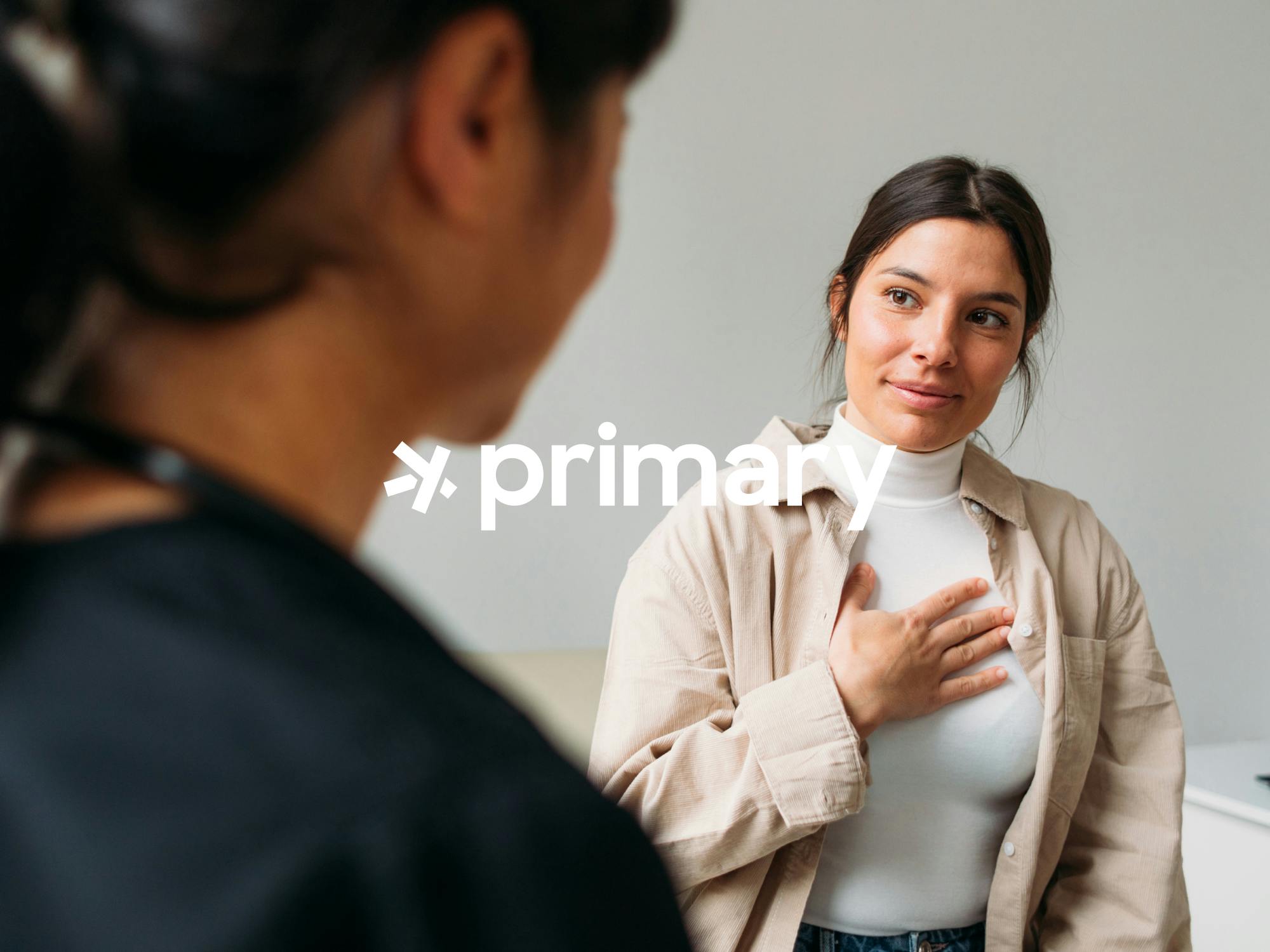
The Family Doctor Reinvented
Primary designs innovative, patient-centered medical offices. We crafted a brand for them that is as warm as it is modern, seamlessly bridging the gap between in-person and digital experiences.
The neobank for freelancers
Qonto approached us to establish the foundations of its brand universe. From digital design to web development, including the design of the blue card: we infused energy into this emerging brand.
Finding work shouldn't be a job.
Uber partnered with Bruno for a new mobile app: Our San Francisco-based web agency team worked closely with them to design the product’s UX/UI.